New year. New typefaces. New Free Fonts.
Are you looking for a change to your website or app design. A new typeface might just be the answer.
And there are so many great options to choose from. Whether you are a fan of a simple sans serif, more traditional modern serif or something with long tails and flourishes, we have a great list of options to try in the coming year.
When it comes to typefaces, personal preference has a lot to do with it. So while this list contains plenty of variation – some popular choices and some lesser-known typefaces – the goal is to help you find a little new type inspiration.
Top 10 Free Font Options
Whether you are a fan of Google Fonts or prefer a downloadable option, there are plenty of great typefaces out there that you can use royalty-free. (Adobe’s Typekit also includes a nice selection for Creative Cloud subscribers – you can debate whether these options are “free” or not.)
The Google options are particularly nice because they are tested and work exceptionally well across platforms and devices (as you might expect), and the platform is easy to use.
Maven Pro

Maven Pro is an original Sans Serif free font that was improved with geometric shapes. It exudes an image of modernity, stylishness, and elegance. Created by Joe Prince, it features three ultra light weights. The extensive glyph coverage lets it collaborate with a ton of projects.
Aileron
You’ll be hard-pressed to find this many weights in another free typeface. (Although you can donate to the type designer upon download.) The sans serif has a slightly ovular shape with uniform strokes that are easy to read at any size, making this a great multipurpose option for body or display type.
Alegreya
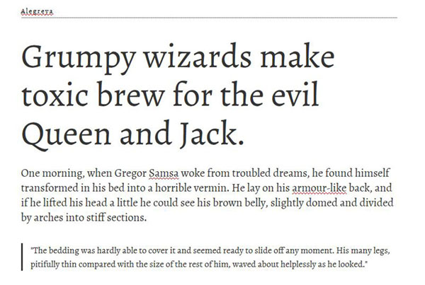
This serif includes thicker strokes with slight variation. The typeface is modern but still has a touch of that old-school style to it. Alegreya was chosen as one of 53 “Fonts of the Decade” at the ATypI Letter2 competition in September 2011 and has been a popular option since. (There’s also a sans serif option if you are really into this typeface.)
Arvo
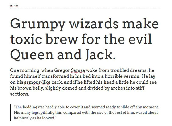
Arvo is a slab serif that’s not too powerful at smaller sizes but can be punched up with all caps at larger sizes. The letters have a nice, rounded form that is simple and striking.
Fira Sans
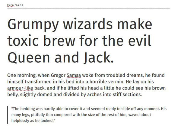
A simple sans serif but with a little more detailed flair than the traditional Helvetica. The letters are a little taller with a more oval shape that feel somewhat casual. Thanks to widths that range from light to bold, Fira Sans can be used for body text or as a display option.
Lato
This has been a favorite among web designers for a few years because of its clean lines, style and versatility. It can work for display and smaller text and includes different weights, making it an ideal family for larger projects.
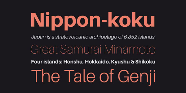
League Gothic
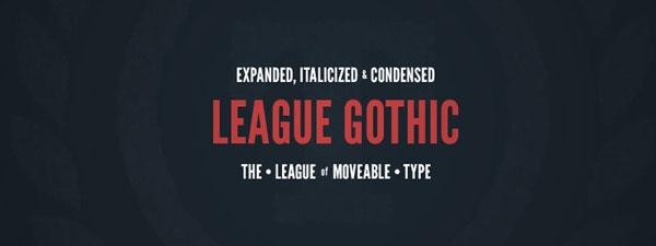
When it comes to display options, this typeface is hard to beat. It has nice thick strokes, a tall x-height and highly readable style that works exceptionally well in a variety of uses. This typeface has been around since 1903 – can you believe it?!? – but has all the clean lines that work with today’s flat and material design styles.
Lobster Two
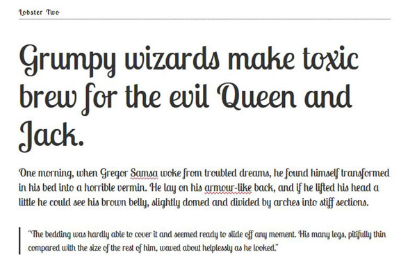
A variation of the once popular Lobster, this version is a little lighter than the original. This nice script style includes plenty of ligatures with letters that change shape based on pairings. So every use of this display typeface ends up looking somewhat custom.
Lora
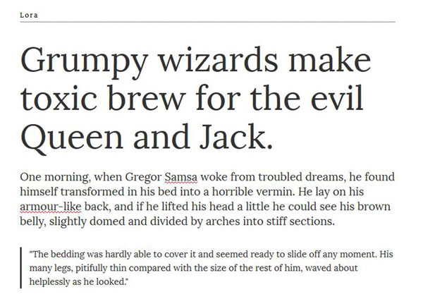
This contemporary serif has roots in calligraphy, and is well-suited for body text styles. The letters tend to take on the feel of their surroundings and can be paired with a number of different display styles, making this a quite versatile typeface.
Stalemate
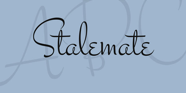
There’s nothing like a simple script to bring attention to the text and this typeface does that masterfully. Unlike some other script options, Stalemate is highly readable (particularly at bigger sizes) and has a gender-neutral feel, so that you can use it for almost any project.
Ubuntu
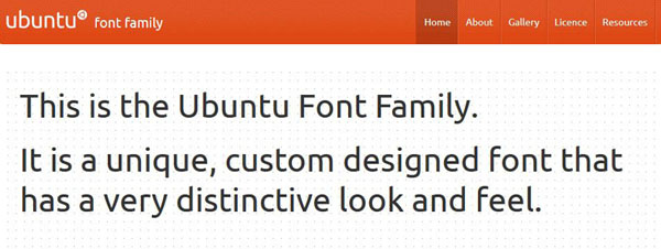
This family includes a full palette of open source options from a sans serif to condensed to monospaced options that is usable in more than 200 languages. The style is contemporary and is labeled as an experimental and ongoing type project with the help of Dalton Maag. (So make suggestions if you have them!)
Top 10 Paid Font Options
Sometimes you really want something a little more robust and detailed than a free font. That’s where many of the paid options on this list come in. Each of these families has wide usage and many are appropriate for both website projects and corresponding print pieces. Prices range from a few dollars for a single style up to thousands for complete family packages.
Avenir
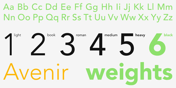
Designed by one of the biggest names in typography, Adrian Frutiger (who has a typeface family named after him), this is a functional san serif with plenty of little extras. While the letterforms are almost round, they are not and the strokes include subtle variations. These details are exactly what you would expect from such a versatile type family. (From $49.)
Blenny
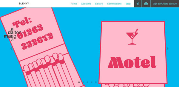
This fat display typeface is pure fun. It has a soft feel to it that can work for branding projects, display text and logo treatments. Everything about the typeface is exaggerated from the wide strokes to tiny spaces in the bowls of letters. (From $23.)
Brandon Printed
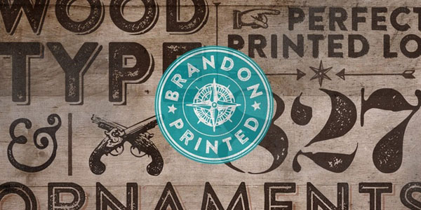
Made just for display uses, Brandon Printed has a trendy aesthetic that would go well with a modern, minimal website design. The strokes are nice and thick with mostly rounded letterforms and touches of roughness. (From $25.)
Chaparral Pro
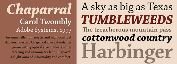
Originally used for book lettering, this serif makes a great body text option. And with 32 styles available, it can expand to other uses as well. The lines are clean and highly readable. (From $35.)
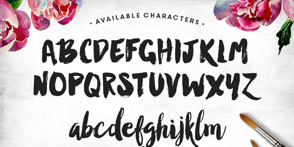
Dexsar Brush
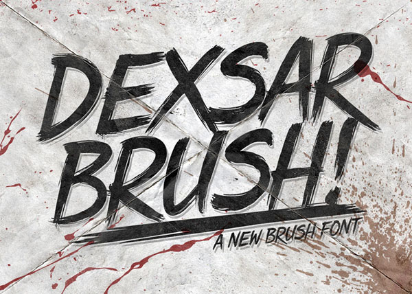
Sometimes only a brush style will do. This font is made for display styles and helps you create a perfectly custom feel. The type style also includes a set of cool discretionary ligatures. (From $20.)
Karnak Pro
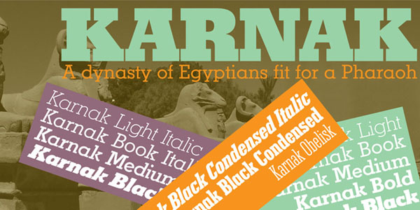
If you love a good slab serif, Karnak Pro is a fabulous option. The old-school typeface was developed in the 1930s but was digitized for web use a few years ago. What’s particularly nice about this slab is that it comes in plenty of weights from a condensed option to a traditional black slab.
Manhattan Darling
This beautiful, fat script has a gritty, imperfect style that looks hand-painted. The special bonus with this typeface is that it comes with end characters for an even more custom style and includes upper- and lower-case styles. (From $16.)
Pacific Northwest
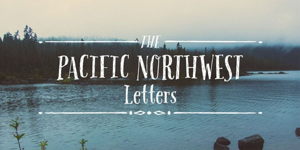
This somewhat “hipster” style typeface has a handwritten, novelty style that’s both fun and easy to use, thanks to clean lines and thicker strokes. Try it with a bold image or color for a real retro feel. (From $29.)
Supria Sans
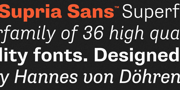
The modern sans serif is a classically-styled, yet playful option that can work for any website design. While a single style might be enough for a small project, the full Supria Sans family is a great investment and will be useful in plenty of projects. (From $50, full family $449.)
True North
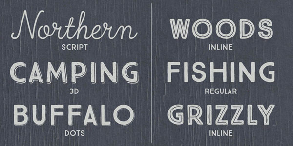
This vintage-style is perfectly on trend and even comes with a bonus set of labels, extras and banners when you buy the complete family of 16 styles and a monoline script. The styles are quite versatile and work great when used together or can stand alone or with other typefaces. (From $18, full family $250.)
Conclusion
Did your favorite font not make the list? Share it with us! What other typefaces are a vital part of your design process? Share them with us in the comments!