No one can argue with the fact that United States is a unique country, where numerous ethnic groups, races, nationalities, as well as different cultures and religions coexist; just as our list of the best USA website designs fascinates online audiences with exceptional diversity, not only in terms of design but also with interactivity and innovative ideas.
Despite a short history compared to other nations, the United States has a rich story, being involved in various art movements including European Modernism, Realism, Impressionism, Abstract Expressionism. It also boasts of some fine arts from indigenous people, and specific directions such as Luminism, Tonalism or the Harlem Renaissance.
It has certainly a spicy cultural legacy that cultivates innovative approaches, creative thinking and love of pioneering methods leading to excellent and exclusive projects.
Best United States Websites
Spacejunk
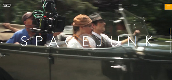
Spacejunk looks like a high-end studio, and the website delivers a strong first impression. It is identified by a series of short videos that vividly sheds light on several key aspects as well as works done. Moreover, the “welcome” section is marked by the refined ultra-narrow typography and sleek matching graphics.
Footjoy Lookbook
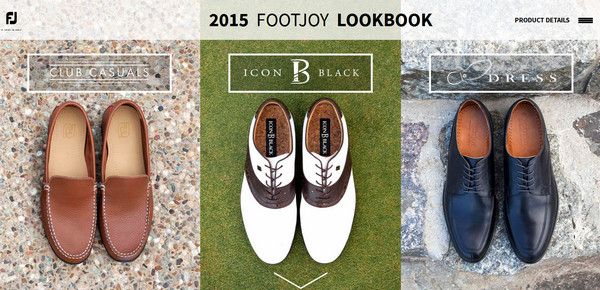
The website keeps things simple and organized. The modern approach of showcasing the new line of products through an online look book certainly has its perks that should generate a higher volume of sales.
Nightcrawler Film
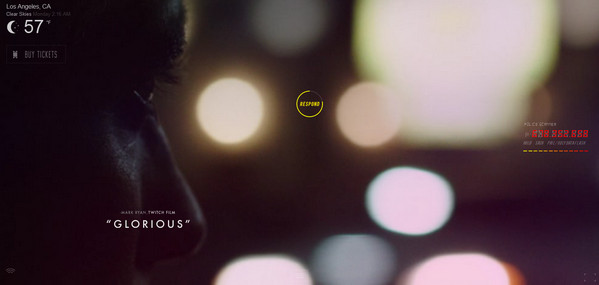
The promotional website heavily relies on the impact produced from a short video taken from the film. The team goes for a more minimalist approach thereby incorporating line style graphics and sharp typography as well as ditching all extra decorations.
Nike
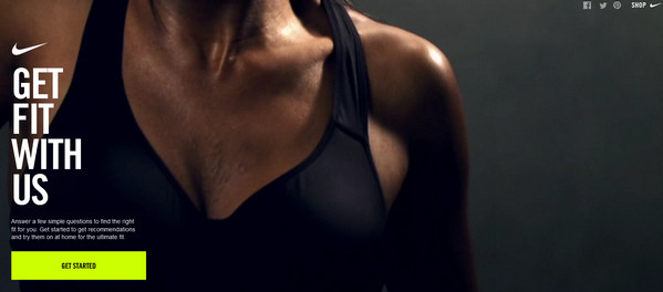
Much like the previous examples, the new Nike advertising campaign is bolstered by a top-notch website that should attract online users. As usual, the team breaks the monotony of regular websites with the help of several short motivational videos charged with an exceptional sports energy.
Blu Homes
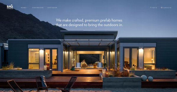
The home page strikes the balance between copy and visuals providing a harmonious design with excellent readability. Moreover, having made a choice toward natural motives, the team is managed to establish a warm and cordial atmosphere that instantly draws you in.
Sound City Project
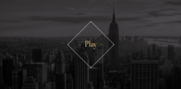
Sound City Project is a pioneering concept that provides a fantastic memorable user experience diluted with a subtle urban vibe. The dark primary coloring along with complementary light graphics and cityscape images sets up a fantastic general feeling.
Dropbox
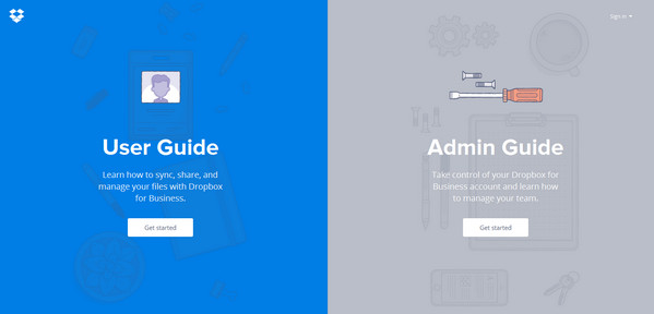
The main page is defined by a magnificent cooperation of flat style and vector graphics supported by a calm muted color scheme. The solution of splitting the main page into two clearly distinguishable parts lets equally meet needs both of users and admins.
Demi Creative
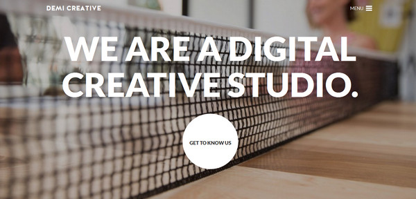
The home page is a representative example of a common way of creating modern online portfolios. It is based on a dynamic background featuring short video, huge, bold tagline that stands in sharp contrast to the backdrop, tiny “hamburger” icon and an eye-catching “call-to-action” button.
Tile App
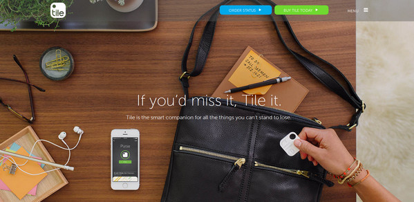
The website leverages another fresh approach to building front pages, which involves incorporating a sophisticated, highly-detailed “hero” image mockup into a header.
Here the promoted product (aka mobile app) has been placed in pleasant office-themed environment composed of various matching object. It certainly grabs attention.
Union
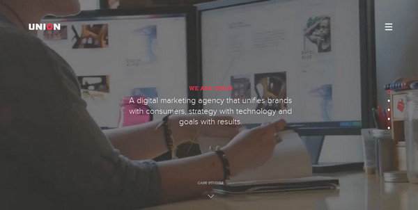
Union with its official website brings a note of subtlety. While the landing page focuses users’ attention on the best works done, the “welcome” screen demands attention straight away through a delicate and harmonious cooperation between image backdrop, tagline and tiny but precise controls.
Story and Heart
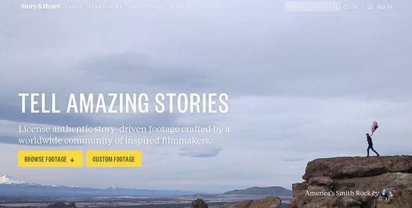
The website from the first seconds lures you into the project, mainly thanks to a series of mind-blowing inspirational videos that enormously contribute to the theme and create an artistic atmosphere.
One Design Company
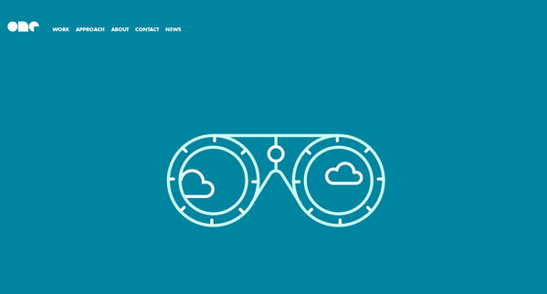
The “welcome” section affords a quite simple yet sleek appearance due to a splendid contour style illustration enlivened with a help of a standard sliding animation, bold appealing logotype, streamlined menu and last but not least, a monochrome background.
V76
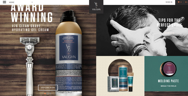
V76 reaps substantial benefits from utilizing basic, commonly used grid style layout. Not only does it provide the website with a harmonious, perfectly-proportional layout that allows elegantly embracing numerous high-quality images but also lays an emphasis on more important things.
Kaber Technology
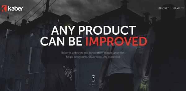
The website has a powerful tech vibe that is achieved through a series of carefully-selected videos, images and highly realistic mockups that are skillfully tied together. Here the content is a king; the team ably accentuates it.
Lapka BAM
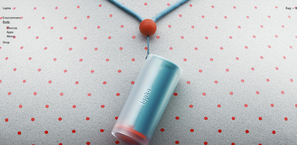
Lapka BAM is a matchless, flawlessly crafted one-page website that showcases a new range of products. Line by line, website drums up interest in users thereby encouraging them to make purchases. The team has skillfully realized a visual stimulation.
Montage
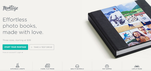
Here, the team managed to meld flat- with skeuomorph-style elements quite well. The website is a harmonious mix of clean, monochrome canvases, animated, subtle line illustrations, contour icons, realistic mockups and photo frames, wooden texture, leather texture and shiny surfaces.
Adventure
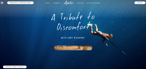
The website has a magnificent adventure vibe. The home page clearly states the philosophy of the project through spectacular underwater scene and dynamic video-based button. Subtle hand-written typography, bright elongated solid graphics and streamlined navigation menu nicely contribute to the environment.
Push
The aesthetics of the front page is based on a vertical slider that gives top priority to images and videos. Such an approach recreates a distinct identity as well as effectively bolsters the brand.
Breezy Excursion
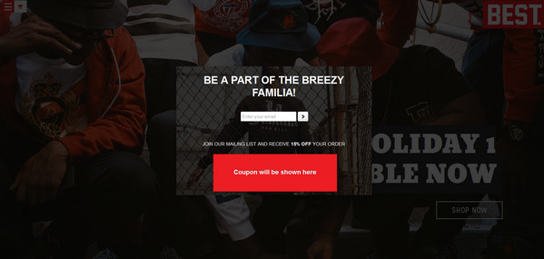
The team leverages an original solution of creating e-stores. At first sight, the website does not look like e-commerce at all: energetic, racy and juicy images suggest something entirely different. However, they establish a proper atmosphere that enlivens the project to bolster sales.
The Capitol
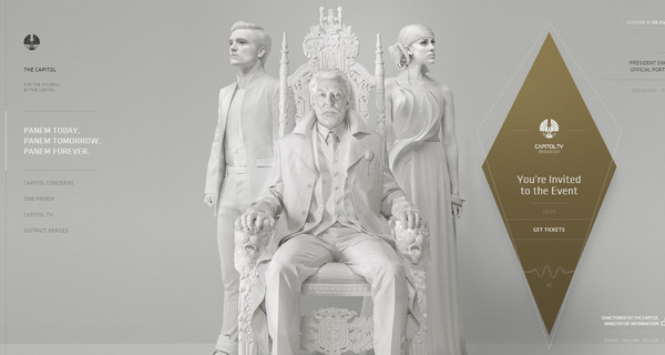
The team tries to highlight both copy and multimedia. As a result, eyes run from numerous visual anchors present in the site. Although a light coloring should smooth the whole impact, yet the page still looks slightly overwhelming.
Conclusion
American-based creative digital agencies push themselves hard in order to produce classy projects, not missing a slightest opportunity to follow trends and use new techniques.