Responsive web design term is related to the concept of developing a website design in a manner that helps the lay out to get changed according to the user’s computer screen resolution. More precisely, the concept allows for an advanced 4 column layout 1292 pixels wide, on a 1025 pixel width screen, that auto-simplifies into 2 columns. Also, it suitably fixes on the smartphone and computer tablet screen. This particular designing technique we call “responsive design”.
Now you can test your website using the Responsive Design Tool.
Responsive web designing is an entirely different designing version than traditional web designing, and developers (especially fresher) must know about the pros and cons of responsive web designing. This blog is a mighty example of the approach so we will reveal a few facts about the uses of responsive web designing. The basic instinct might be to choose media queries to develop a responsive site. However, the hassle one faces with media queries is that new queries can pop up from moment to moment; each time, the user experiences sudden and drastic changes to the look and organization of the site. Experts suggest using some CSS transitions to ease the jump.
Pages that include data tables pose a special challenge to the responsive web designer. Data tables are extremely wide by default, and when someone zooms out to see the whole table, it becomes too small to read. When one tries to zoom in to make it readable, he or she is supposed to scroll both horizontally and vertically to look through it. Well, there are several ways to avoid this problem. Reformatting the data table as a pie or mini-graph is an approved solution. The mini-graph fixes even in narrow screens.
Images in responsive web designs are called context-aware. This particular technique serves the purpose of responsive designing in true sense as the images serve at different resolutions, ranging from larger screens to smaller ones. The scaled images appear to change fluidly with the help of updated developer tools and coding languages, allowing designs to look sharp in every context.
Responsive web designing is remarkably different from traditional designing in terms of technical and creative issues, and a careful use of this can do wonders while designing.
Responsive Web Design Examples
Designmodo
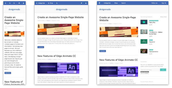
Designmodo has a very clean and clear design with a perfect responsive design interface. The images and the text scaled perfectly on different mobile screens sizes.
Simon Collison

Though nowadays this greyish grid-style static website looks a bit boring and dull, however when it was released it caused some kind of furor with its high-end layout.
The main reason was that the designer primarily focused its attention on responsive behavior that was only gaining popularity those days thereby providing ordinary developers with a representative example of how regular grid-style layout should gracefully transform.
Andersson-Wise Architects

Being dedicated to an architecture and design studio it doesn’t surprising that the main focus of the website are photos that showily represent skills, experience and clients of the company.
The landing page includes 3 main sections, each of which is based on image background. The flexibility solution helps to effectively form a proper structure for every standard screen size, creating a pleasant content flow for readers.
Stephen Caver

Stephen Caver has a topnotch website when it comes to responsiveness. You will definitely ask, what so special in it. The answer is simple, take a closer look at the front page and you will see; it consists of
- huge welcoming message dished up with a help of a rough typography;
- set of huge blocks that is a duplication of the main menu on the top;
- regular layout for blogging.
So as to say, 3 essential aspects that can be found on every website. The designer gives us a hint of how typography, grid-style markup and blog section should change according to device screen dimensions.
Sparkbox

Sparkbox demonstrates a basic structure of a corporate website. The layout is pretty simple; it is based on a standard, commonly-used set of horizontal stripes that present data in a non-intrusive manner. Such structure is really easy to adapt to various screen sizes. The sequential arrangement of blocks deprived of embellishments undergoes changes quite smoothly and effortlessly, giving users a nice-looking and well-organized layout.
Food Sense

Transformation from a regular left-sided blog-style magazine layout populated with numerous yummy pictures to an elementary block-by-block layout – here is how the main process of adaptation looks like in this website.
However, there is nothing supernatural; it is believed to be a typical solution to a great deal of projects that want to attract online readers from mobile web, win over new audience, and at the same time, save the website’s aesthetics from a visual overload.
The Boston Globe

The Boston Globe is an excellent example of a well-thought-out news-related website that is based on a responsive layout. The website takes on a conventional approach that is helpful for those who are eager to run its own frequently updated online magazine.
Though as befits, at first sight it seems that the website has a complex, slightly messy outward that is really hard to handle, actually the solution is really primitive. The designer has wisely split all the information into 3 columns, the amount of which decreases according to screen size, slowly but surely passing stages of displaying data in 2 columns and finally in one; in this way you will be also able to set a necessary order of showcasing your blocks.
Think Vitamin

To be honest, Think Vitamin can’t boast of anything particular concerning its blog design. It has the same markup as everyone else’s. It has 1 main column with a right-sided widgetized sidebar, a header populated with navigation, a logotype and a search bar, and a footer that presents information via set of blocks.
However, the team not just mindlessly uses a responsive framework as a base; they also actively muster support from some styling elements. Thus, a contrasting color palette helps to distinguish content blocks and some functional elements such as social media and ads, enhancing visual perception for mobile users and reinforces readability.
Sasquatch! Music Festival

Sasquatch! Music Festival has to deal with a lot of multimedia content including videos and dynamic effects that in addition is spiced up with some artistic hand-written lettering and fantastic graphics. So for the team, it is quite a challenge to display everything correctly on mobiles and tablets.
Nevertheless, the responsive behavior here is well elaborated. It neatly touches every detail, creating a visually pleasing appearance that doesn’t lose its charm of originality and creativity even on small screens.
Internet Images

This is another clean well-organized website that is based on a flexible horizontal stripe layout. The responsiveness here is also effectively bolstered by a color differentiation that visually separates one logical block from another.
Such simple yet powerful combination helps to increase readability chiefly on small devices where, as a rule, everything is presented as a one continuous data stream that, because of an inherent monotony, is able to easily destroy all the piquancy and decrease readers’ interest.
Staffanstorp

Here, an ability of a beautiful adaptation to smaller screens as well as to bigger ones brings such benefits as
- perfect readability regardless of devices that display your website;
- well-structured appearance for increasing information hierarchy;
- easily conveying messages to readers that mostly leverage tablets and mobiles.
Though the blog designs is not differ from others, yet its desire to satisfy current web requirements takes it at the whole new level.


14 Comments