Difficulty: Intermediate
Estimated Completion Time: 45 minutes
In this tutorial, we are going to create a Statistics Panel using HTML and CSS3. We’re going to use Google Fonts for this tutorial, specifically “Roboto.”
HTML
First, let’s create our HTML structure.
We need a wrapper or a container, we’ll name it “stats-panel.” We’ll have a header, with a title and calendar views. Plus, a body which will include: three categories new users, recurring users, page views; and a data chart, where we will include an SVG image.
For this HTML structure we’re going to have the following code:
<div class="panel">
  <div class="panel-header">
    <h3 class="title">Statistics</h3>

    <div class="calendar-views">
      <span>Day</span>
      <span>Week</span>
      <span>Month</span>
    </div>
  </div>

  <div class="panel-body">
    <div class="categories">
      <div class="category">
        <span>New Users</span>
        <span>1.897</span>
      </div>
      <div class="category">
        <span>Recurring Users</span>
        <span>127</span>
      </div>
      <div class="category">
        <span>Page Views</span>
        <span>8.648</span>
      </div>
    </div>

    <div class="chart">
      <div class="operating-systems">
        <span class="ios-os">
          <span></span>iOS
        </span>
        <span class="windows-os">
          <span></span>Windows
        </span>
        <span class="android-os">
          <span></span>Android
        </span>
      </div>

      <!--    Place the stats numbers here    -->

      <!--   Place the SVG here     -->

    </div>
  </div>
</div>
CSS
Great, we’re done with the HTML part, now let’s stick to the CSS part. First of all, let’s make sure that the body has full height and we also want our panel to be centered, for this, we’re gonna use flexbox.
* {
  box-sizing: border-box;
}

html, body {
  height: 100%;
  width: 100%;
  display: flex;
  justify-content: center;
  align-items: center;
  font-family: 'Roboto', sans-serif;
  background: #efefef;
  overflow: hidden;
}
You’ll notice that we’ll use flexbox in many situations from now on because is simple and easy to use.
Now that our panel is centered, but what panel? Let’s make it together. Let’s make it 750×400, add some rounded corners, and some shadows.
.panel {
  width: 750px;
  height: 400px;
  background: #838CC7;
  box-shadow: 1px 2px 3px 0px rgba(0,0,0,0.10);
  border-radius: 6px;
  overflow: hidden;
}
Great, divide the panel in two sections, one will be the header and one the body.
Let’s make the header first, with a title and the calendar view buttons; align them using flexbox.
.panel-header {
  display: flex;
  justify-content: space-between;
  align-items: center;
  padding: 0 30px;
  height: 60px;
  background: #fff;
}

.title {
  color: #5E6977;
  font-weight: 500;
}

.calendar-views span {
  font-size: 14px;
  font-weight: 300;
  color: #BDC6CF;
  padding: 6px 14px;
  border: 2px solid transparent;
}
Let’s go forward and style the body. Here we have some user categories on the left and a data chart on the right. First, let’s give the panel body a height of 340px and make it display flex for child elements.
.panel-body {
  display: flex;
  height: 340px;
}
Great, on the left are three categories. We want them to be one above another, and for this we use flexbox, again. Let’s also give to each category a style.
.categories {
  display: flex;
  flex-direction: column;
  justify-content: space-between;
  flex-basis: 25%;
  padding: 39px 0px 41px 26px;
}
.category {
  display: flex;
  flex-direction: column;
}
.category span:first-child {
  font-weight: 300;
  font-size: 14px;
  opacity: 0.6;
  color: #fff;
  margin-bottom: 6px;
}
.category span:last-child {
  font-size: 32px;
  font-weight: 300;
  color: #fff;
}
Cool! On the right side of the body we’re going to have a chart with some data, but first let’s make a legend on the top, for users to better understand the symbols used in a chart or diagram. This will include the three mobile operating systems used in the chart.
Style the chart section and the legend by adding the following lines:
.chart {
  width: 100%;
  height: 100%;
  display: flex;
  flex-direction: column;
  flex-grow: 2;
  position: relative;
}

.operating-systems {
  display: flex;
  justify-content: space-between;
  width: 215px;
  margin-top: 30px;
  margin-bottom: 50px;
}
span[class*="-os"] {
  font-size: 14px;
  font-weight: 300;
  font-size: 14px;
  color: #c3c6e4;
}
span[class*="-os"] span {
  width: 9px;
  height: 9px;
  display: inline-block;
  border-radius: 50%;
  margin-right: 9px;
}
.android-os span {
  background: #80B354;
}
.ios-os span {
  background: #F5A623;
}
.windows-os span {
  background: #F8E71C;
}
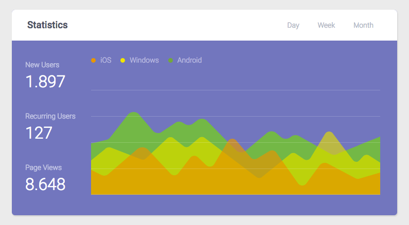
This is what we’ve accomplished.
Looks great, right?
Now let’s add the SVG on the HTML inside the chart container that we’ve created:
<svg width="563" height="204" class="data-chart" viewBox="0 0 563 204" xmlns="http://www.w3.org/2000/svg">
        <g fill="none" fill-rule="evenodd">
          <path class="dataset-1" d="M30.046 97.208c2.895-.84 5.45-2.573 7.305-4.952L71.425 48.52c4.967-6.376 14.218-7.38 20.434-2.217l29.447 34.46c3.846 3.195 9.08 4.15 13.805 2.52l31.014-20.697c4.038-1.392 8.485-.907 12.13 1.32l3.906 2.39c5.03 3.077 11.43 2.753 16.124-.814l8.5-6.458c6.022-4.577 14.563-3.676 19.5 2.056l54.63 55.573c5.622 6.526 15.686 6.647 21.462.258l37.745-31.637c5.217-5.77 14.08-6.32 19.967-1.24l8.955 7.726c5.42 4.675 13.456 4.63 18.82-.11 4.573-4.036 11.198-4.733 16.508-1.735l61.12 34.505c4.88 2.754 10.916 2.408 15.45-.885L563 90.915V204H0v-87.312-12.627c5.62-.717 30.046-6.852 30.046-6.852z" fill="#7DC855" opacity=".9"/>
          <path class="dataset-2" d="M563 141.622l-21.546-13.87c-3.64-2.343-8.443-1.758-11.408 1.39l-7.565 8.03c-3.813 4.052-10.378 3.688-13.718-.758L469.83 84.58c-3.816-5.08-11.588-4.687-14.867.752l-28.24 46.848c-2.652 4.402-8.48 5.673-12.74 2.78l-15.828-10.76c-3.64-2.475-8.55-1.948-11.575 1.245l-53.21 43.186c-3.148 3.32-8.305 3.74-11.953.974l-100.483-76.2c-3.364-2.55-8.06-2.414-11.27.326l-18.24 15.58c-3.25 2.773-8.015 2.874-11.38.24L159.91 93.79c-3.492-2.733-8.467-2.51-11.697.525l-41.58 39.075c-2.167 2.036-5.21 2.868-8.117 2.218L39.05 112.5c-4.655-1.808-9.95-.292-12.926 3.7L0 137.31V204h563v-62.378z" fill="#F8E71C" opacity=".6"/>
          <path class="dataset-3" d="M0 155.59v47.415c0 .55.448.995 1 .995h562v-43.105l-40.286 11.83c-3.127.92-6.493.576-9.368-.954l-53.252-28.32c-5.498-2.924-12.323-1.365-15.987 3.654l-25.48 34.902c-4.08 5.59-12.478 5.513-16.455-.148L360.06 121.92c-2.802-4.073-8.2-5.457-12.633-3.237L322.2 133.827c-4.415 2.21-9.792.848-12.604-3.196L282.78 99.25c-4.106-5.906-12.978-5.6-16.665.57l-26.757 44.794c-3.253 5.446-10.753 6.468-15.36 2.092l-16.493-15.673c-4.27-4.058-11.138-3.522-14.72 1.148l-23.167 30.21c-3.722 4.852-10.937 5.207-15.12.744l-44.385-47.345c-5.807-5.427-14.83-5.508-20.734-.19l-55.76 48.31c-3.76 3.26-9.127 3.93-13.582 1.703L0 155.59z" fill="#F5A623" opacity=".7"/>
          <path class="lines" fill="#FFF" opacity=".2" d="M0 203h563v1H0zM0 153h563v1H0zM0 102h563v1H0zM0 51h563v1H0zM0 0h563v1H0z"/>
        </g>
</svg>
This is how it looks:
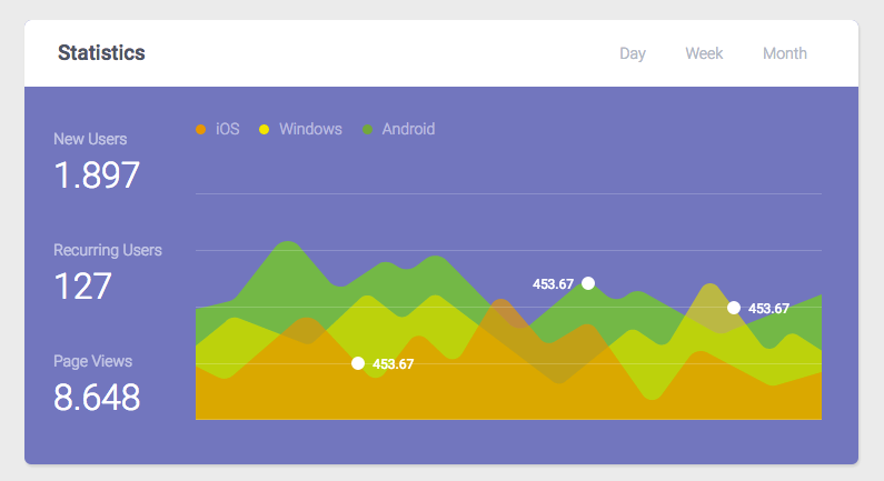
Now, we need to add data to the chart, some stats, in a bullet format. In HTML add the following lines:
  <div class="android-stats">
    453.67<span></span>
  </div>
  <div class="ios-stats">
    <span></span>453.67
  </div>
  <div class="windows-stats">
    <span></span>453.67
  </div>
We’ll display them absolute on the chart and style them a little bit by adding the following lines of CSS:
div[class*="-stats"] {
  position: absolute;
  color: #fff;
  font-size: 12px;
  display: flex;
  opacity: 0;
  animation: showstats 0.6s linear 1.8s;
  animation-fill-mode: forwards;
}

div[class*="-stats"] span {
  height: 12px;
  width: 12px;
  margin: 0 7px;
  background-color: #fff;
  border: 2px solid transparent;
  border-radius: 50%;
}

.android-stats {
  bottom: 155px;
  right: 230px;
}

.ios-stats {
  bottom: 83px;
  left: 133px;
}

.windows-stats {
  bottom: 133px;
  right: 62px;
}
Here’s how it looks:
Not bad, right? But wouldn’t be better if we animated some elements? Let’s animate it.
First, let’s animate the calendar view buttons by giving them a border on hover:
.calendar-views span:hover {
  border: 2px solid #BDC6CF;
  cursor: pointer;
  border-radius: 15px;
}
Now let’s make the bullet stats scale a little bit and have the legend background color on hover:
div[class*="-stats"] span:hover {
  transform: scale(1.4) rotate(0.02deg);
  border: 2px solid #fff;
  cursor: pointer;
  transition: transform 0.2s ease-in-out;
}

.android-stats span:hover {
  background: #80B354;
}

.ios-stats span:hover {
  background: #F5A623;
}

.windows-stats span:hover {
  background: #F8E71C;
}
Awesome! Let’s allow the chart to grow/scale and the lines and the stats to appear/show after that, this will happen when the user opens the page. For this we use @keyframes. So add the following lines:
.dataset-1 {
  animation: raise .8s linear 1;
  transform-origin: bottom;
}
.dataset-2 {
  animation: raise 1.6s linear 1;
  transform-origin: bottom;
}
.dataset-3 {
  animation: raise 1.8s linear 1;
  transform-origin: bottom;
}

.lines {
  opacity: 0;
  animation: showlines 0.6s linear 1.6s;
  animation-fill-mode: forwards;
}

@keyframes showlines {
  to { opacity: 0.2; }
}

@keyframes showstats {
  to { opacity: 1; }
}

@keyframes raise {
  0% { transform: scaleY(0.01); }
  75% { transform: scaleY(1.1); }
  100% { transform: scaleY(1); }
}
Looks great, doesn’t it?
The tutorial is done! You can take a look at the demo.

I hope you enjoyed it and learned something new. If you have any questions, ping me!
Download the Shopping Cart UI


2 Comments