Some say that with three-tone coloring it is quite difficult to go wrong. This number of colors is considered to be the golden mean creates beautiful and eye-pleasing aesthetics while staying vibrant and vivid. This rule can be safely applied to the smallest parts of UI such as icons.
Although lavish material design focuses on creating something huge, loud and lavish; there is always room for delicate, refined and modest graphics that effectively embrace minimalism and take the advantage of a limited color scheme.
Today, we are going to take a look at 20 icon sets with crisp and subtle appearances thanks to a nominal palette.
3-Tone Icons
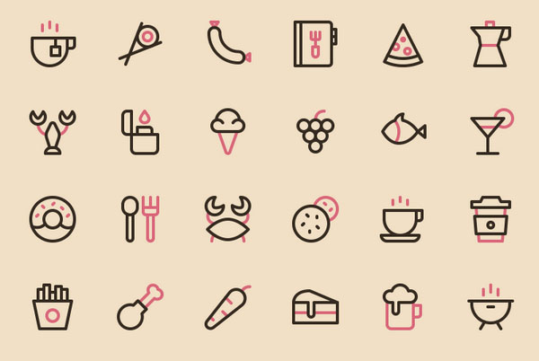
Creaticons
Creaticons: Food & Beverages is an impressive icon set of 72 yummy icons that come in three different style variations – outlined, filled and colored — for 216 total images.
Illustricons
Illustricons is an icon pack like no other. It includes 520 elements that were carefully designed with versatility in mind so that you have the ability to do more than you can ever imagine.
Random Icons by Nick Slater
Random Icons by Nick Slater uses four tones where three are shades of blue. Only three play a vital role. The coloring perfectly complements the theme of a set and conveys practical and diligent mood.
WP Cafe del Museo icons by Israel Ortiz
WP Cafe del Museo icons by Israel Ortiz leverages green as a secondary color that serves as a focal point and an instrument that ties the design together. While red evokes an appetite, green adds naturalness.
Four-Pack by Sebastian Abboud
Four-pack by Sebastian Abboud is marked by warm coloring where dark brown perfectly collaborates with black. White is used to outline the shape of each icon and make important details more prominent.
Small Business Club Icons by Andrew Ronaldson
Small Business Club Icons by Andrew Ronaldson is a series of sleek line style icons where black performs a primary role, red is used for accents and negative space glues everything together. Much like the first example, the designer uses an extra gray shade for adding pleasant complementary touches.
Nationwide Illustrations by Tomomi Sohn
Nationwide Illustrations by Tomomi Sohn has an inviting nature thanks to careful color choice. Shades of blue run the show. White space also plays a significant role not only providing each item with a fresh air but also serving as a backdrop.
FREEBIES – 42 Flat iOS Icon Set by HevnGrafix Design
Here some icons employ three-tone coloring, others opt for four tones. Nevertheless, at first glance the second option is not so obvious since orange, white and green is simply overwhelming. Each icon has smooth edges, shadow, and even a 3D feeling. Grab this free set and enjoy its potential.
Icons by Meg Lewis
Icons by Meg Lewis look positive and visually attractive. Yellow and black nicely go together. Although they are a bit oversimplified and have mostly geometric nature, they radiate a sense of delicacy and seize attention to convey a message.
Kitchen Icons Freebie by Joby Varghese
Kitchen Icons Freebie by Joby Varghese is a set of professionally visualized kitchen utensils. While soft and calm blue gives a feeling of sophistication, smooth lines make each item look friendly. The color scheme is highly harmonious. The package is free.
Nucleo Food Free by Sebastiano Guerriero
Nucleo Food Free by Sebastiano Guerriero is another freebie in our list that is driven by a skillful combination of two basic colors and excellent use of white space. There are lots of circles and smooth lines that help illustrate each concept. The pink color displays distinctive features that add zest to the aesthetics.
Process Icons / Blog Launch by Garrett Campagna
Process Icons / Blog Launch by Garrett Campagna have a relatively huge size and plenty of details. Red and black illustrate the point while white space provides a solid foundation and legibility.
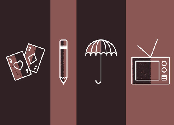
Rockstar Onesie by Alyssa Welch
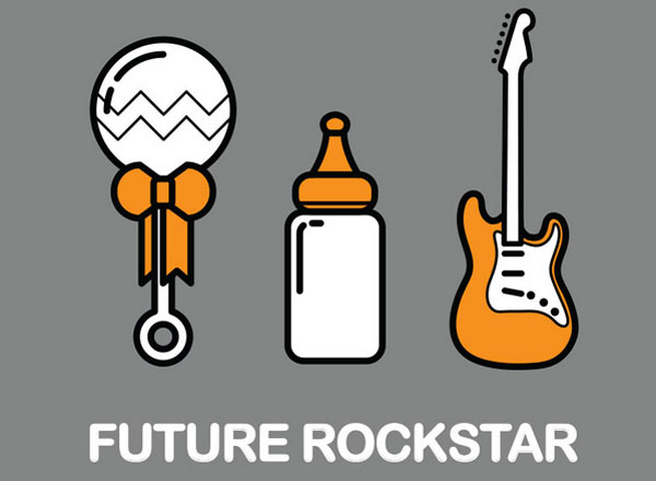
Rockstar Onesie by Alyssa Welch features three professionally crafted icons that are based on standard three-tone coloring. Black is used for delineating the shape, white fills space, and orange adds subtle accents.
Cupcakery Icons by Joash Berkeley
Cupcakery Icons by Joash Berkeley look sweet, yummy and loud, exactly how they should be. The well-chosen selection of colors reinforces the theme and does not overpower with schmaltzy feel.
15 Years of Pantone – Upgrade by Annie Ratcliffe
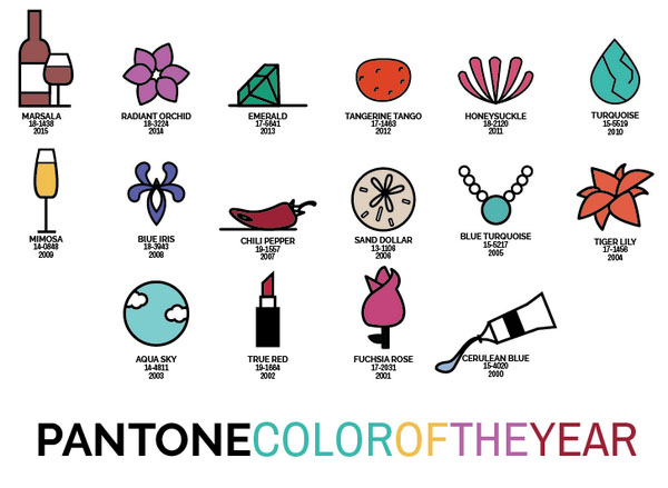
The artist presents a project dedicated to Pantone, reminding us about the 15 colors of the year in a visually appealing manner. Each icon relates to the chosen tone. Neutral white and black are used to form the design and not distract the attention from the “winner.”
Night Mode Icon Set by Jinglu Li
Night Mode Icon Set by Jinglu Li is fantastic and original. The coloring helps show the spirit and mood of the project. Dark blue with bright yellow is a powerful combination that does not require assistance. Solid or outline they are certainly worth your attention.
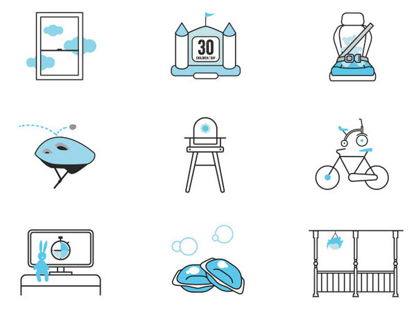
Food Allergens Icons by Tunde Szentes
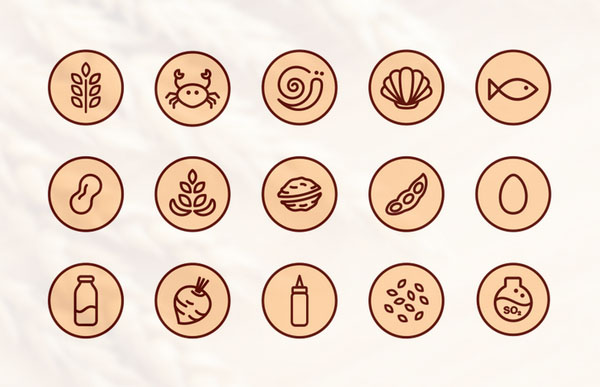
Food Allergens Icons by Tunde Szentes have a natural vibe and an organic feeling thanks to well thought out color choice. Circular shape and line style provide an appearance with delicacy and elegance. Shades of the same color harmonize the design.
Free E-commerce Set of 80 Icons by Anton Scherbik
This free e-commerce set of 80 icons by Anton Scherbik is a pleasant gift for those who need to create an e-store interface. The icons are minimalist yet intuitive and legible, with two-tone coloring, where orange is used as an accent and gray is used for outlining the shape to establish a businesslike feel.
Icons for UX & Research Company by Diana Wieczorek
Three-tone coloring and a skillful use of white space make this set stand out. Yellow catches and maintains the user’s focus as well as adds a nice twist to the design. They are well-suited to corporate websites that need to set up the serious atmosphere with a subtle quirky note.
Youtube Icons by Joseph Wells
Youtube Icons by Joseph Wells has a hint of 3D technology. Red and blue fit together perfectly. The nice twist is an intersection area. Each icon seizes the attention and looks fresh, original and unique.
Icon Circles by Cody Fitzgerald
Again, a color scheme that strongly relies on blue to reproduce a fascinating and high-quality set of icons. Each item exudes an image of serenity and busyness. Shades play together well, heightening the harmony. White space makes a vital contribution.
Freebie: 16 Line Illustrations by Vincent Tantardini
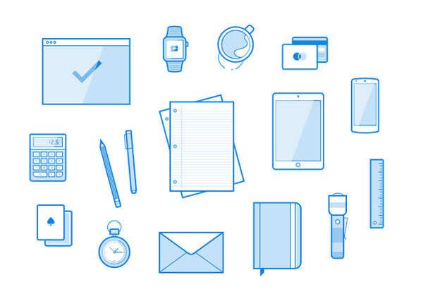
Freebie: 16 Line Illustrations by Vincent Tantardini includes neatly designed stationery items and devices that — thanks to bluish coloring — delivers a strong first impression. White and two shades of blue complement and reinforce each other.
Conclusion
Three-tone coloring is quite sufficient to portray an idea, elicit a message and create a distinctive identity. Teamed with line style or flat style, it reveals power that does not overwhelm users and envelops them with a peaceful and friendly surrounding.