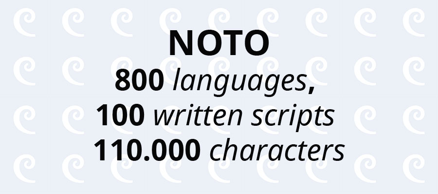
Font lovers around the world rejoice! After six years of intense collaboration between Google and Monotype, Noto Font, the universal font, is here. With support for 800 languages, 100 written scripts and more than 110,000 characters, Google’s Noto is like the Babel Tower but without the confusion. So, if you are planning to build a time capsule, travel to the future or design your own Stonehenge, you should look no more. All joking aside, Noto is a revolution in communication. For the first time, we finally have a universal tool to communicate and consume content.
Developed by Google and designed by Monotype, Noto is the result of a titanic project with implications well beyond typography. So, what makes Noto so special? We’ll explain it here.
[embedded content]
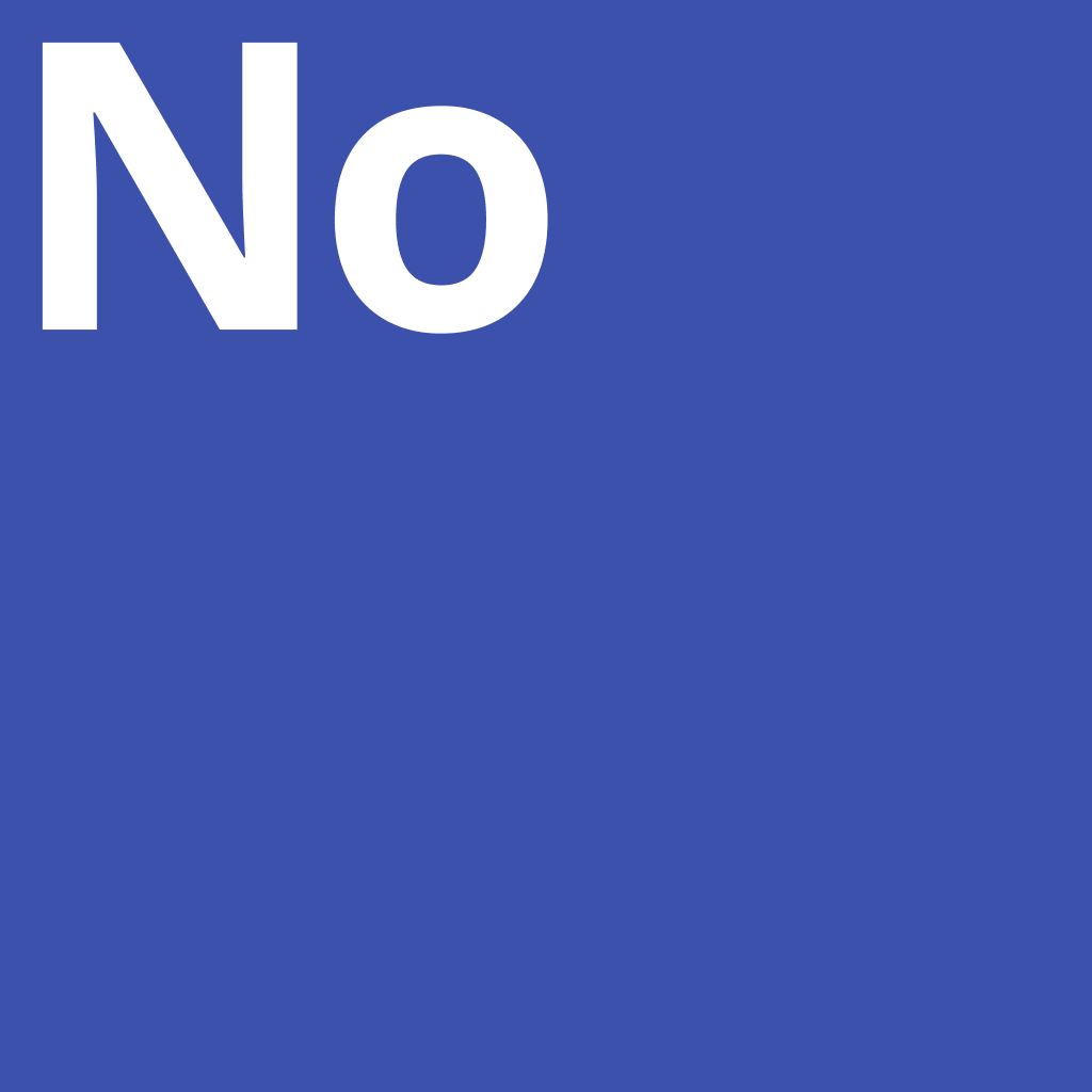
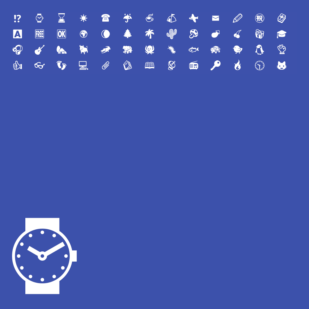
What is .notdef aka Tofu?
Unicode is a character encoding standard developed by the Unicode Consortium, with the goal of providing a consistent encoding, representation and handling of text in world’s writing systems. The latest version of Unicode, 9.0, contains a repertoire of more than 128,000 characters covering 135 modern and historic scripts including multiple symbol sets.
The standard consists of:
- A set of code charts for visual reference
- An encoding method and a set of standard character encodings (UTF-8, UTF-16, etc.)
- A set of reference data files (ASCII files and binary files)
- Miscellaneous items, such as character properties, rules for normalization, decomposition, collation, rendering and bidirectional display order (for right-to-left scripts and left-to-right scripts)
Unicode is required by modern standards such as XML, Java, ECMAScript, etc., and is supported in modern operating systems, browsers and many other products. More than 135 scripts are included in the latest version of Unicode. When your device is unable to display a character, a placeholder replaces the missing glyph. Usually, this placeholder is a rectangular box (?) and is referenced as .notdef by coders or tofu by the rest of the world. If you write in languages like English, Mandarin Chinese, Russian or other Unicode supported script, the chances to run in a .notdef are slim, however, the world is much more diverse than that. With Noto supporting more than 800 languages, with more to be added soon, it’s time to say goodbye to “tofu.”
Beauty Is in the Eye of the Beholder
Google’s Noto is a beautiful font. Not necessarily from a typographic point of view. Noto is beautiful because it is a gate to the future through the past and present, and because it is the ultimate tool to eliminate historical communication barriers.
“When we began, we did not realize the enormity of the challenge. It required design and technical testing in hundreds of languages, and expertise from specialists in specific scripts. In Arabic, for example, each character has four glyphs (shapes a character can take) that change depending on the text that comes after it. In Indic languages, glyphs may be reordered or even split depending on the surrounding text.” – Xiangye Xiao and Bob Jung @ googleblog.com
Developed as a font to be used in Google’s Android and ChromeOS, the Noto project quickly scaled up. NOTO (NO to TOfu), the tofu killer, was designed to be a uniform typeface, which looks great on any display and in any language. While it’s not the first font to cover different scripts, is the first to visually unify them harmoniously. For example, before Noto, if you were addressing global communities, you had to license fonts for different scripts. For example, one for Latin scripts, one for Arabic, another one for Japanese or Chinese scripts. And while the smart designer could somehow combine them to provide a unified user experience, the aesthetics would suffer. A flawed aesthetic on top of a nice product or service is not acceptable for Google, and should not be acceptable for any designer looking to provide the best UI/UX to its users.
“We are passionately dedicated to type and helping to advance the use and adoption of type across many cultures, languages and geographies. We are thrilled to have played such an important role in what has become one of the most significant type projects of all time. The combination of Monotype’s type expertise and Google’s innovation has proven to be a productive relationship and we look forward to continued collaboration that helps advance the use of type to new places,” said Scott Landers, president and CEO of Monotype @ Monotype.
The idea that Google developed, in six years, a typeface for languages with different calligraphic aesthetics, that feels cohesive and in line with each language’s cultural heritage it’s not only an exercise of efficiency but is also a testimony of humanity’s potential in building a better world for future generations.
“I feel that looking into the future of digital communications, Google Noto is going to be the go-to design for people to be using to communicate across multiple cultures and societies,” said Steve Matteson, creative type director, Monotype.
The architect behind Noto is Monotype. The team headed by Matteson had the task to implement Google’s technical requirements in order to deliver a product which would achieve the scope of the project. In order to do so, hundreds of researchers, designers and linguists from around the world worked researching old alphabets and scripts, hand drawings, sketching, forming and reviewing to develop a truly universal font.
From an aesthetic point of view, the typeface was not developed to win beauty contests. It’s sufficiently neutral to feel the same in different scripts, but, in the same time, it’s not austere (imagine the Tibetan script in a Futura-like typeface). Every font has a similar weight and aligns to an imaginary line that bisects the Latin alphabet. While not all languages rest at the same baseline and capline, the fonts feel cohesively bound augmenting the continuity which Noto is supposed to deliver.
“Our goal for Noto has been to create fonts for our devices, but we’re also very interested in keeping information alive. When it comes to some of these lesser used languages, or even the purely academic or dead languages, we think it’s really important to preserve them. Without the digital capability of Noto, it’s much more difficult to preserve that cultural resource,” said Bob Jung, director of internationalization, Google @ Monotype.
Noto’s real beauty resides in its concept. In a post-analog era, the Noto typeface is a manifesto for future generations, a manifesto which will allow the preservation of languages and cultures consumed by the shift to a digital society.
Where Can I Get Noto?
The fonts, design source files and the font building pipeline are available under an OFL (Open Font License). You can use Noto for UI, printing material, text in video and billboards, etc. For local use on your computer, download the Noto fonts and the design sources. To use the fonts in a native app, bundle them within your application. If you use the fonts in web content, don’t forget to use them as web fonts, otherwise, the browser will automatically fall back to another font.