In the field of web designing newer tools are invented and introduced in the market very often. HTML is a language that is used to structure and present contents for the websites. This technology have seen many changes and goes through many improvements since its first introduction in 1990. Now the latest version of HTML that is known as HTML5 is used to create amazing designs for websites. Both HTML5 and CSS3 are now become one of the most trusted and widely used trend of designing websites to the web designers and developers.
There are reasons why website designers and developers like to use these languages while preparing codes for a website. These languages are really very user friendly. You don’t need to be a highly qualified computer engineer to design websites with them. A basic knowledge of HTML coding can make the process an easier one for the novices as well. Moreover, there are lots of websites templates that are created with the help of HTML5 and CSS3 to make them perfect for any kind of websites. These templates can be downloaded for absolutely free from the internet and use for creating a stunning website or else you can purchase the premium version of HTML5 and CSS3 website templates and develop an exclusive site.
These HTML5 and CSS3 websites are very interesting in terms of look and designs. People love to visit such websites as they have plenty of features that can attract visitors easily. Since the websites that are designed with HTML5 and CSS3 can be edited anytime so, site owners like to have them. They can do little changes in their sites like adding or changing some images or contents at anytime they want. This feature obviously makes the HTML5 websites popular among the website owners and the web designers and developers as well.
While searching for HTML5 websites in the internet one can find thousands of examples. There are lots of companies who like to prefer HTML5 and CSS3 to create their websites. Other than that they can show us how advanced technologies like HTML5 and CSS3 can help us in getting better, improved service in obtaining more useful and nice looking websites in the zone of internet. High class, creative, stylish, effective and comprehensible websites can be designed with the use of languages like HTML5 and CSS3.
HTML5 and CSS3 Websites Examples
Adobe – The Expressive Web

The UI feels fun, amusing and approachable. The first thing that gets noticed is, of course, an expressive geometric minecraft-inspired typeface that is increasingly original and inventive.
Pixel art goes perfectly well with isometric projection thereby recreating an outstanding aesthetics with inviting nature.
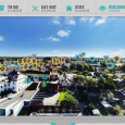
OrangeSprocket
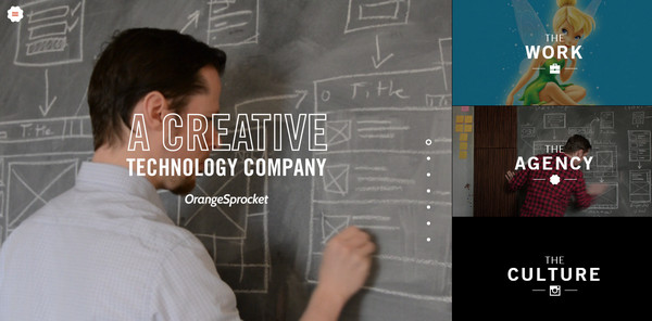
The online audience is greeted by one-screen homepage that is minimal, compact yet with a great visual interest. The team has adapted a refreshing solution. The page is split into two parts. The first column can be scrolled: in such a way the team encourages viewers to surf through the works. The second one is fixed and is reserved for navigation.
The latter is aimed to provide users with a quick access to the inner structure. Each option is displayed with the help of image and accompanying title and is enhanced with a subtle eye-pleasing effect.
Har Du Det I Deg

The project has a businesslike atmosphere and casual language that produce a distinct general impression. It offers visitors to take part in a small quiz that will decide whether you own necessary skills to become a teacher or not. It is spiced up with several dynamic effects and micro interactions such as a loading spinner.
HTC
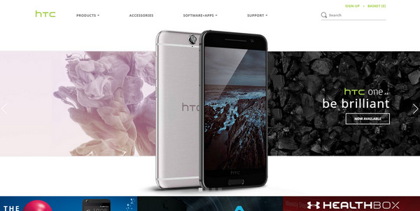
The project has a businesslike atmosphere and casual language that produce a distinct general impression. It offers visitors to take part in a small quiz that will decide whether you own necessary skills to become a teacher or not. It is spiced up with several dynamic effects and micro interactions such as a loading spinner.
Beercamp 2012

Beercamp 2012 is imbued with joy and cheerfulness. Funny mascot on the header gets users in a positive and jovial mood within seconds. This quirky illustration sets the tone and surrounds the visitors with an aura of upcoming event. Dynamic tooltips are here for informative purposes.
Suit Up or Die Magazine

To enjoy the website at full extent you need to own a monitor with at least 1600x1000px resolution, yet it still looks good on tablet devices. The cell-phone users can contemplate a letter of apology. The project is concentrated around the content that is dished up in a pleasant way. Everything contributes to fascinating reading.
Casey Britt

The UI is based on an intuitive layout that lines up content in vertical order. It is multimedia-rich, however, it still maintains visual clarity thanks to harmony between images and text. There are also lots of sliders which can be viewed both as advantage and drawback. The information is carefully arranged in carousels that are good, of course.
However, if you examine the website via a tablet, sections may begin to blink before your eyes due to dense placement and high sensitivity of touch screen monitor.
Lois Jeans

The company is well-known for its love to creating original lookbooks of new collections that are powered with modern trends and techniques. They quite regularly incorporate HTML5 features into their websites. And this project is no exception. It is driven by an excellent multilayer aesthetics that is composed of numerous photo shots. You can explore the timeline and find out interesting facts and events. As befits, your journey through the history is accompanied by tiny effects.
Glamour.biz

Glamour.biz has a website with a twist. It is an example of how to painlessly combine glamour and brutality. Although an illustration of a punk with mohawk and piercing is difficult to call an icon of sophisticated style and luxury, however this peculiar trick gives the UI an artistic appeal and speaks about the lateral thinking inherent to the agency.
Whether you browse the project through the PC or tablet, you will get an excellent user experience thanks to fully adaptive foundation.
Bobadilium

Illustrated background, a bit aggressive coloring, powerful urban vibe, grunge touches, heavy and rough typography are things that make the website stand out from the crowd. Opting in favor of such a unique and unconventional design, the company, which by the way specializes in consulting services, tries to indicate that it prefers individual approaches to every situation.
Societe Generale

With the assistance of a classic two-column layout, extra spacing, carefully outlined areas and solid info boxes, Societe Generale lets users quickly scan the flow and saves them from feeling overwhelming. The team has come up with an ideal solution for content-intensive project. What’s more, they are also managed to enhance UI with modern features such as hamburger menu button and flexible and highly adaptive grid system.
Whiteboard

Whiteboard is defined by a traditional horizontal stripe layout that handles all the content whether it is a simple copy, images or videos like a pro. The agency leverages a video backdrop for the header section that serves as a virtual guide through the company office. As you may have noticed, the dynamic gif has a poor quality; however, it was done on purpose, since in such a way, it provides the titles on a foreground with a proper contrast.
Ghost Horses

Ghost Horses’ official website is enriched with charming decorative elements that add to the aesthetics a lovely artistic flavor and subtle skeuomorphic appeal.
The UI is exploration of trends that were popular in early 10s of our century. There are ribbon-style details, dynamic badge-like rosette that takes up the central position, buttons with 3D-dimensional look, and subtle gradient pattern used for the main backdrop.
FiftyThree
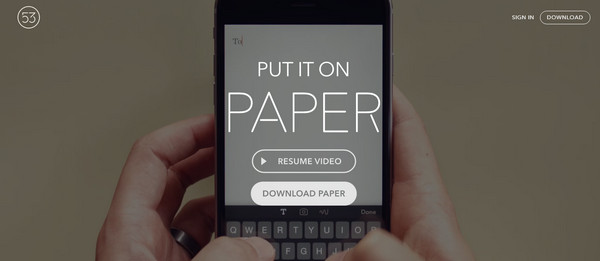
FiftyThree has a website that is an excellent example of how to promote the product in our days. One-column structure is divided into several functional sections that clearly describe the item from different angles. Since it is an app for mobile devices, the header section exhibits a video with a walkthrough and the content area has an iPhone mockup. Although these things seem to be a cliche, yet they still do the trick.
lend your leg

The design easily gives enough prominence to the new collection by utilizing some interactive. A huge slider that features products and an accompanying sidebar with the extra functions and small carousel serve as a powerful informative tool. The streamlined navigation on the top helps users to move around more confident.
