Used mainly in online stores in order to increase conversion rates, progress indicators make users pass the required procedures which are necessary to complete the purchase. Along with a shopping cart it is the basis of quality and thought-out site. Each of you encounters it numerous times and not necessarily during visiting an e-commerce site. Majority of large respectable sites with open member systems or those who provide various services such as booking or ordering includes such type of procedure.
Being similar to a breadcrumbs it also helps to navigate users but in a more advanced way. It is an important part in cooperation between users and application. The main task of which is to walk users through different multi-step process by making it easy and intuitive.
It should inform users about following aspects:
- What tasks user has completed, preferably with a visual results
- Current section he is on
- Which and how many steps still remain also preferably with clear designation
In order to be sufficient and effective each part has to consist of explanatory data. First of all, it should have proper title and tiny description that will briefly explain the purpose of this step. Secondly, it is usually supplemented by various user interface elements such as polls, contact or any other kinds of form.
Approaches of creating progress indicators
There are no particular methods of creating excellent progress trackers. Always remembering of how your users interact with the system – is the key to success. Generally, designers prefer to create process steps as simple as possible in order not to confuse users even more. Furthermore, a paucity of visual effects will dramatically optimize your site, but it doesn’t mean that your system should be plain and dull. To make it user-friendly you should embody several features:
- Numbering the steps
- Show the direction of movement, as a rule it is from left to right
- Distinguish the current step
- Incorporate an indicator that shows successful completion of a step
- Visual representation of a progress using tabs or simple links can be very confusing
- Don’t make the process too long (3-5 steps will be enough)
- Greeting final message with results
As for standard progress tracker design, it includes rather plain interface, simple outline fields to complete and a bit of graphics which are used only to make the system fits perfectly into whole website design.
Along with them there are nonstandard designs that often lie in the use of unusual shapes and vivid graphics. You can easily meet implementation of such approach on design-oriented websites. On the one hand such method makes the process more cheerful and entertaining, but on the other hand it can bring confuse and misunderstandings. Although with well-thought structure and a small number of tasks this option may be winning.
In the list below I have put together different examples of process tracker designs that mainly focuses on rather simple but truly effective designs.
Progress Indicators Examples
Form steps v2 by Ionut Zamfir
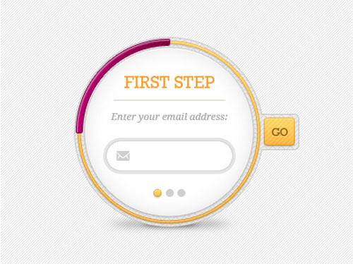
Form steps v2 by Ionut Zamfir break the monotony of classic and banal horizontal striped progress bars with the help of a circular form. It demonstrates an excellent use of textures and coloring as well as takes the advantage of divine roundness. This 3-step component embraces all the essential details, laying out them in an original manner.
Welcome Steps by Luke Beard
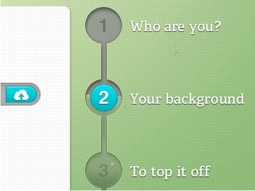
Welcome Steps by Luke Beard exploit vertical orientation that naturally guides users’ eyes from top to bottom. Thanks to skillfully applied embossed effect, the indicator perfectly cooperates with the textured environment and blends in. The liquid-inspired inner part along with glossy touches creates splendid artistic aesthetics.
UI Sliders by Ashish Thakkar
UI Sliders by Ashish Thakkar pull their identity from lush and intricate skeuomorphic style. The traditional horizontal progress bar looks fantastic. Tiny details such as subtle shadow that make the tooltip stand out from a canvas or shiny metallic button that draws the attention create the whole buzz.
Steps by Nadine Haardt
Steps by Nadine Haardt have a less realistic appearance than the component in the previous example, yet it also looks naturally inbuilt into the background. Grey and green nicely cooperate with each other while a subtle diagonal pattern adds zest. An idea of adding liquid-styled filling easily separates the component from the others.
Checkout page for Madein33 by David Cadusseau
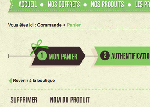
Checkout page for Madein33 by David Cadusseau gets its beauty from a ribbon shape and some neatly crafted elegant ornamental details. Each step has a shape of a relatively huge arrow that points out the path. The artist leverages flat style to make it look clean and shadows to give an extra depth.
USCIS Case Tracker Widget by Sebastiaan de With
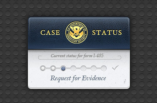
USCIS Case Tracker Widget by Sebastiaan de With has a serious personality and a casual language. The artist is managed to reproduce the proper atmosphere by using leather textures and decorative elements such as golden emblem or delicate cursive typography. The main part of the widget stays clean and easy to perceive. The embossed progress bar does not have any special traits, but it fits the theme.
Progress Steps by Justin Roberts
Progress Steps by Justin Roberts shine and magnetize with glossy and vibrant appearance. The component looks even a bit toxic because of a bright green tone. It utilizes a standard horizontal orientation to look more natural to the users.
Payment Gateway API: resources for developers
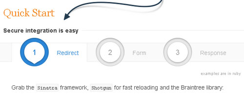
Payment Gateway API features a classic progress indicator with a polished and refined appearance that effectively embraces numerous stages of the payment process. Not only does the artist go for a time-tested layout to make the process more intuitive but he also uses color differentiation to visually separate checked and upcoming stages.
Form Step 2 by Pim Luiten
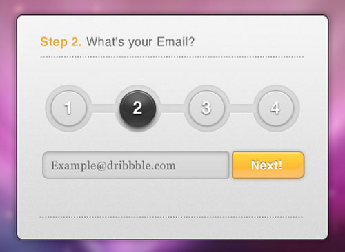
Form Step 2 by Pim Luiten looks nice and fresh. Grayish coloring recreates a businesslike feel while a splash of orange color puts the focus on the submit button and adds warmth. The artist utilizes skeuomorphic-inspired elements to give the widget more sophisticated and intricate look.
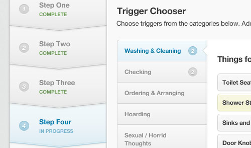
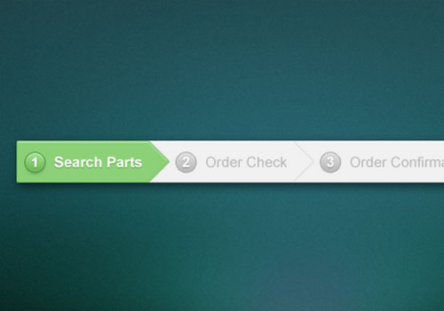
Steps left by Mihai Mari
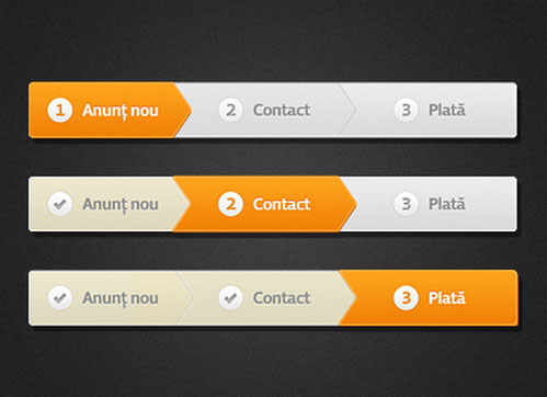
Steps left by Mihai Mari have a breadcrumb-like appearance that thanks to a bright orange shade charges interface with the energy. The author utilizes three-tone coloring to clearly indicate various statuses of stages such as default, checked and unchecked. The shot also shows the component in action step by step.
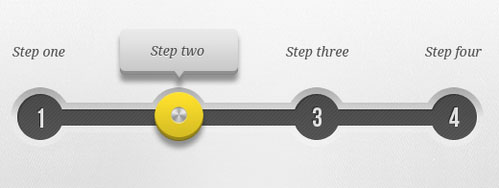
1 2 3 Done! by Eryk Pastwa
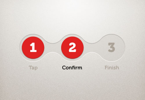
The component manages to pull off elegance and delicacy with an ease. The component looks refined and subtle. Smooth lines and circular shapes recreate a marvelous appearance. Red color gives checked stages more dominant position and points out the progress right away.
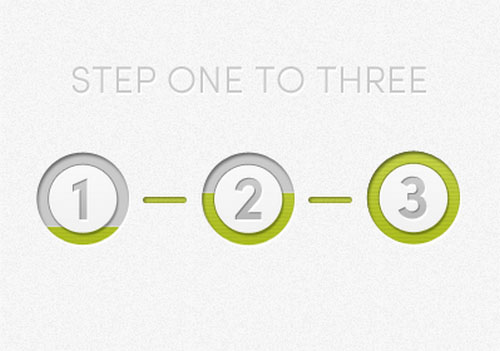
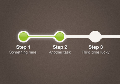
Steps by Bruno Martins
Steps by Bruno Martins look much like the previous example. It is also a three-stage progress indicator where round shape sets the tone and underlies the aesthetics. However, there is no accented color that will provide users with focus anchors. The author goes for a matching and seamless palette that makes it look modest and casual.
Flight Tracker for iPad by InnovationBox
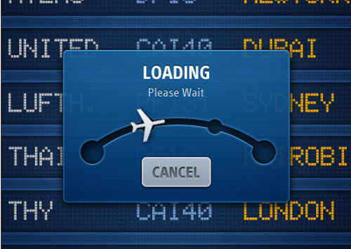
Flight Tracker for iPad by InnovationBox pursues consistency in style and significantly supports the overall theme with its unique and original plane-like indicator. The widget has a glossy and slightly transparent background and uses deep blue to mimic glass surface. An arc styled path with round pointers contributes to the flight theme while semi-realistic metallic button serves as a nice finishing touch.
Checkout progress bar – Web UI by Jason Wu
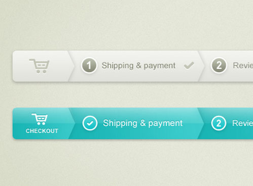
The author demonstrates two versions of the design: the first one is the default and the second one shows the component with the completed stage. They differ from each other only in coloring. The first one is made in a soft combo of gray and beige while the second option derives smoothness and serenity from gorgeous turquoise. Subtle shadows and embossed effect add spice and enhance the appearance.
Schedule A Session by zee7
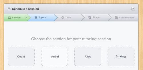
Schedule A Session by zee7 has a seamlessly inbuilt breadcrumb-styled progress bar that takes up not much space on the top and perfectly collaborate with the overall design. Green is used for passed stages, blue is for selected, and gray is for upcoming ones. The color palette is matching and the overall design is harmonious.
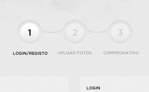
Step Process by Danny Keane
Step Process by Danny Keane utilizes a simple and ordinary layout and vertical orientation. The progress indicator is straightforward to users. Much like in the previous example, the artist uses three various shades: green, blue and gray, to strengthen difference among basic states.
Step 2 by Rareview
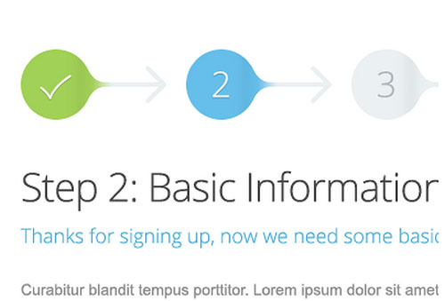
Step 2 by Rareview is a three-stage progress indicator that not only gets the most out of color differentiation but also makes skillful use of captions. The latter transforms from a number into a check sign when the stage is completed. The component has a smooth and fluid appearance and creates a distinct eye track due to arrow styled backdrops.
Order Steps by Gabriel Seabra
Order Steps by Gabriel Seabra naturally lead you through all stages. The progress bar has a neutral and calm color scheme in which green indicates completeness. Although it is ultra narrow, and there is no much free space, yet the author is managed to embrace all the integral details and even enrich the aesthetics with ornamental details such as 3d dimensional feel and embossed touch.


6 Comments