Practical as they are visually attractive, card interfaces are more than just a trend.
With 2014 marking the first time mobile internet usage exceeded desktop, web design is now favoring the small screen as responsive design becomes mandatory. The result: simple interface styles like the new flat design, minimalism, and especially cards are more popular than ever.
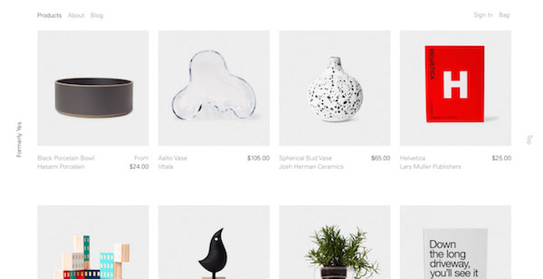
Source: Formerly Yes
The usefulness of the card UI pattern goes beyond loading times and translating across different screen sizes. Bite-sized content matches the attention span of most web users (especially on mobile devices). Nurtured by Pinterest and then popularized by social media sites like Facebook and Twitter, card UIs can now be found across websites of all industries.
In this article, we’ll explore the rise of the card UI pattern: why they’re useful, how they fit into responsive and material design, and what to expect from them in the future.
What’s Container-style Design?
To understand this pattern, you must first understand the card itself.
Cards are basically small containers of each information, with each card representing its own singular thought. A card can hold all types of content — visuals, text, links, etc. — but all fall under a single unified theme.
Filling the screen with such independent containers of information is what the Guardian calls the “container model.” This provides a mucher cleaner and instantly comprehensible interface, attuned to quick browsing so the user can go straight to what they’re looking for. (On top of that, this method lends itself to gesture controls, which we’ll explain below.)
Useful and attractive: the benefit of the card UI pattern is two-fold.
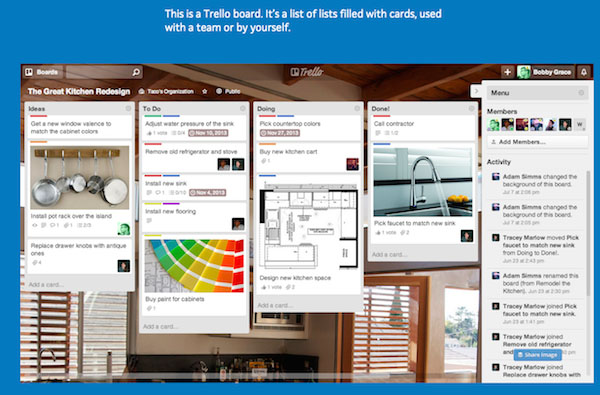
Photo credit: Trello
Trello lets users create any card they want. Anyone can create “to-do” cards and categorize them as needed.
Not only does this illustrate the card’s flexibility, it also demonstrates its organizational power. Trello succeeds because their card format feels simpler than traditional list-style task managers.
UI Cards in Mobile and Responsive Design
As mentioned above, cards offer excellent compatibility with responsive frameworks, causing some like Des Traynor of Intercom to call it “the future of the web.” The pattern translates well to mobile devices for a variety of reasons, which we’ll explain now.
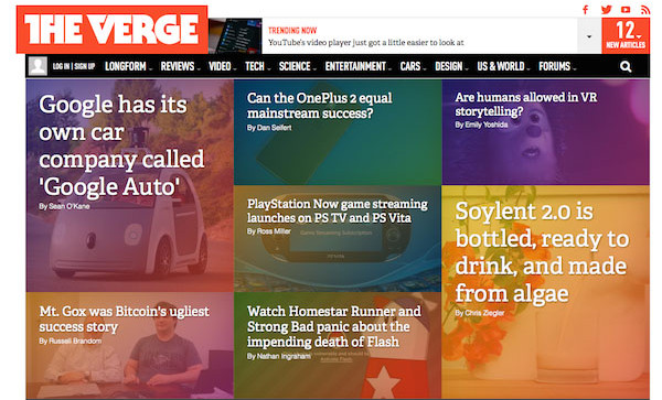
Source: The Verge
First, in frameworks that expand and contract, cards grids can restructure themselves to fit any breakpoint or screen size. Designers can be quite flexible with the card’s aspect ratio (plus how groups of cards fit together). For example, you can set a fixed-width with variable height, using consistent spacing between cards.
Compare the above screenshot from The Verge to its mobile viewport below:
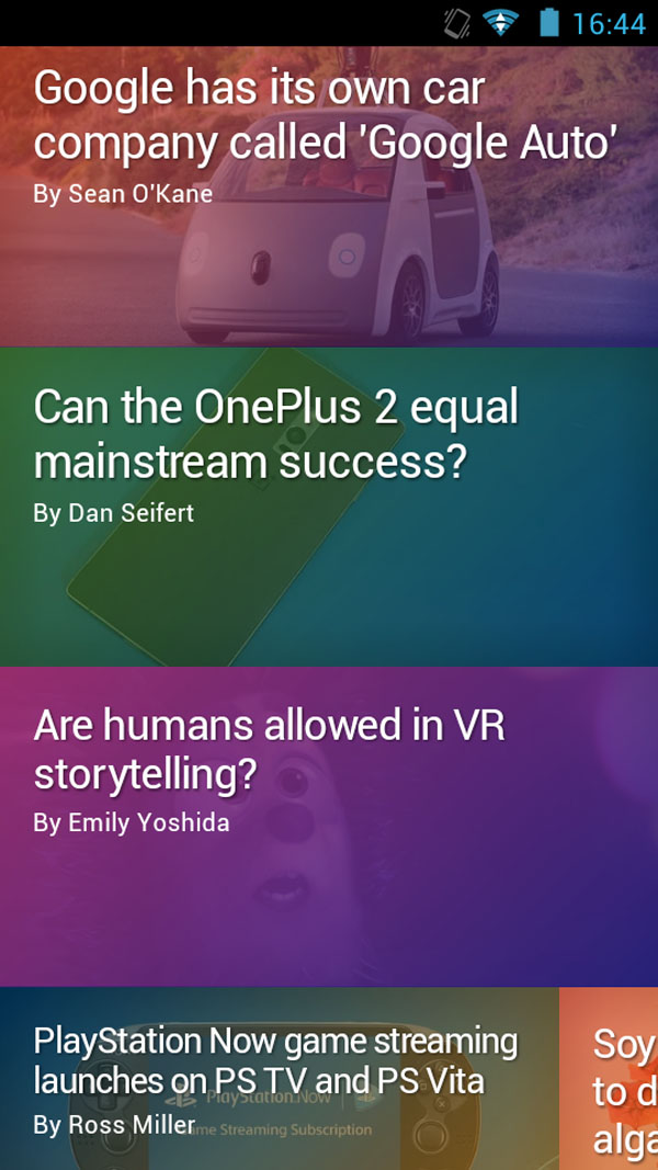
Source: The Verge (mobile)
Notice how the text, image, and style of coloring remains the same as well. Cards allow for a consistent experience across devices.
You can see this advantage in play for the free design library offered by UXPin. Notice how cleanly the layout scales up from the mobile to full-size viewport.
Mobile Viewport:
Source: UXPin
Full-Size Viewport:
Source: UXPin
Another advantage is how the card style fits accommodates gesture controls. On touch screens, the cards act as buttons without any extra effort. The idea is simple: tap the card to interact with the content.
As Fitts’s law applied to web design shows, the greater the clickable area of a button, the easier it is to interact with. How many times have we all struggled clicking the tiny text links on mobile devices?
Cards and Material Design
Material Design relies heavily on cards, and their thorough analysis of the technique holds a lot of weight. Their description of cards in the material design guide is worth checking up if you’re looking for a thorough explanation.
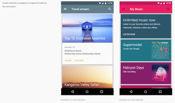
Photo credit: Google
The Future of Cards
While the card UI pattern is constantly reshaping itself to fit new challenges, responsive and app design will probably be the most-affected design disciplines. As described in Web Design Trends 2015 & 2016, this shift is in part due to the paper-like influence Material Design is having over Android apps.
1. Technology
Cards might not remain static for long. As web performance improves, so too will the ability to support richer multimedia content. You’ll probably see much more detailed elements, such as auto-updating content that won’t slow down the entire experience.
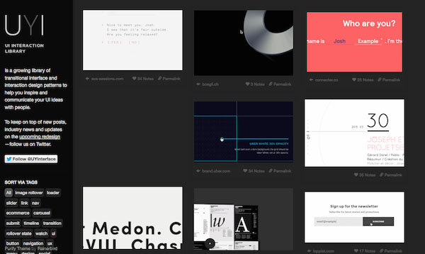
Photo credit: Use Your Interface
Videos replacing images (an idea that some designers have flirted with for years) might become more popular. Use Your Interface (above) features animated GIF cards that make the homepage a joy to experience.
2. Deeper Interaction
In the near future, cards may also get more creative than acting as links. As we see with Material Design, cards vary depending on individual interactions, with such features as automatic sorting and real-time updates (i.e., weather forecasts).
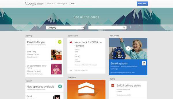
Photo credit: Google
Windows Phone has already started auto-sorting the cards , but there’s definitely potential to infiltrate the larger mobile user base.
3. Size
Side-by-side with the trend of hero images, cards are also adopting a “bigger is better” policy.
Big cards allow for more detail and intricate typography, which means more opportunity for delightful visual design. When used interchangeably with smaller cards, larger cards allow for greater freedom in visual hierarchy.
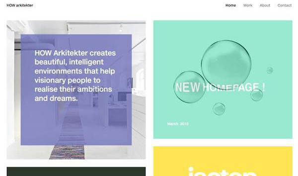
Photo credit: How Arkitekter
HOW Arkitekter (above) mixes large- and medium-sized cards as part of its navigation. Some cards are links, while others simply provide static information. Wide gutters separate the cards, which provides plenty of breathing room.
4. Wearables
Thanks to Google Glass, cards have now been established as a staple of wearables UI design.
Photo credit: Google
While critics may consider Google Glass a commercial flop, others think it has a chance in the business market. Regardless, wearables must make efficient use of space. Cards, then, are the most practical choice.
Takeaway
Across all mediums and devices, cards are becoming a mainstay for organization and functionality. Their current form may change as they evolve alongside technology, but their presence is ensured.
After all, these digitized squares are hardly the first form. Don’t forget that, not too long ago, cards were just sheets of paper that contained bits of information for one central idea.