Difficulty: Intermediate
Estimated Completion Time: 30 minutes
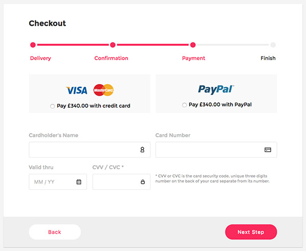
Hello, everyone! In this tutorial, we are going to create a Shopping Checkout Form using HTML, CSS3 and a little bit of jQuery. We’re going to use Google Fonts for this tutorial, specifically Montserrat.
HTML
The first thing we need to do is to create our HTML structure.
We need a container to wrap everything around, we’ll name it “checkout-panel.” Inside we’ll have two main sections, a body and a footer.
Body
- Step progress bar
- Two payment methods
- Some input fields
Footer
- Two buttons
This is the code for the checkout panel:
<div class="checkout-panel">
  <div class="panel-body">
    <h2 class="title">Checkout</h2>

    <div class="progress-bar">
      <div class="step active"></div>
      <div class="step active"></div>
      <div class="step"></div>
      <div class="step"></div>
    </div>

    <div class="payment-method">
      <label for="card" class="method card">
        <div class="card-logos">
          <img src="img/visa_logo.png"/>
          <img src="img/mastercard_logo.png"/>
        </div>

        <div class="radio-input">
          <input id="card" type="radio" name="payment">
          Pay GBP340.00 with credit card
        </div>
      </label>

      <label for="paypal" class="method paypal">
        <img src="img/paypal_logo.png"/>
        <div class="radio-input">
          <input id="paypal" type="radio" name="payment">
          Pay GBP340.00 with PayPal
        </div>
      </label>
    </div>

    <div class="input-fields">
      <div class="column-1">
        <label for="cardholder">Cardholder's Name</label>
        <input type="text" id="cardholder" />

        <div class="small-inputs">
          <div>
            <label for="date">Valid thru</label>
            <input type="text" id="date"/>
          </div>

          <div>
            <label for="verification">CVV / CVC *</label>
            <input type="password" id="verification"/>
          </div>
        </div>

      </div>
      <div class="column-2">
        <label for="cardnumber">Card Number</label>
        <input type="password" id="cardnumber"/>

        <span class="info">* CVV or CVC is the card security code, unique three digits number on the back of your card separate from its number.</span>
      </div>
    </div>
  </div>

  <div class="panel-footer">
    <button class="btn back-btn">Back</button>
    <button class="btn next-btn">Next Step</button>
  </div>
</div>
CSS
Now that we’re done with the HTML, let’s make our checkout panel look cool. We’ll give the page some basic styling and center our panel.
* {
  box-sizing: border-box;
}

html,
body {
  font-family: 'Montserrat', sans-serif;
  display: flex;
  width: 100%;
  height: 100%;
  background: #f4f4f4;
  justify-content: center;
  align-items: center;
}
Now, let’s style our .checkout-panel and make it 940×766 pixels. Add style to it and we’re good to go:
.checkout-panel {
  display: flex;
  flex-direction: column;
  width: 940px;
  height: 766px;
  background-color: rgb(255, 255, 255);
  box-shadow: 0 1px 1px 0 rgba(0, 0, 0, .2);
}
Cool! Now let’s go further and style the body and elements inside of it. First, add padding to the body and style the title:
.panel-body {
  padding: 45px 80px 0;
  flex: 1;
}

.title {
  font-weight: 700;
  margin-top: 0;
  margin-bottom: 40px;
  color: #2e2e2e;
}
The next element is the .progress-bar. We will use Pseudo elements, :before and :after to style the step progress bar.
.progress-bar {
  display: flex;
  margin-bottom: 50px;
  justify-content: space-between;
}

.step {
  box-sizing: border-box;
  position: relative;
  z-index: 1;
  display: block;
  width: 25px;
  height: 25px;
  margin-bottom: 30px;
  border: 4px solid #fff;
  border-radius: 50%;
  background-color: #efefef;
}

.step:after {
  position: absolute;
  z-index: -1;
  top: 5px;
  left: 22px;
  width: 225px;
  height: 6px;
  content: '';
  background-color: #efefef;
}

.step:before {
  color: #2e2e2e;
  position: absolute;
  top: 40px;
}

.step:last-child:after {
  content: none;
}

.step.active {
  background-color: #f62f5e;
}
.step.active:after {
  background-color: #f62f5e;
}
.step.active:before {
  color: #f62f5e;
}
.step.active + .step {
  background-color: #f62f5e;
}
.step.active + .step:before {
  color: #f62f5e;
}

.step:nth-child(1):before {
  content: 'Delivery';
}
.step:nth-child(2):before {
  right: -40px;
  content: 'Confirmation';
}
.step:nth-child(3):before {
  right: -30px;
  content: 'Payment';
}
.step:nth-child(4):before {
  right: 0;
  content: 'Finish';
}
Notice the power of Pseudo elements and how we used it to make the progress bar.
The next element is the .payment-method. We have two payment methods, one for credit cards and one for PayPal. Divide the space in two columns, and align using flexbox.
.payment-method {
  display: flex;
  margin-bottom: 60px;
  justify-content: space-between;
}

.method {
  display: flex;
  flex-direction: column;
  width: 382px;
  height: 122px;
  padding-top: 20px;
  cursor: pointer;
  border: 1px solid transparent;
  border-radius: 2px;
  background-color: rgb(249, 249, 249);
  justify-content: center;
  align-items: center;
}

.card-logos {
  display: flex;
  width: 150px;
  justify-content: space-between;
  align-items: center;
}

.radio-input {
  margin-top: 20px;
}

input[type='radio'] {
  display: inline-block;
}
Great! Now we have a section with multiple input fields with information about cards. We can change the color of the border on :focus and add an icon for each input tag.
.input-fields {
  display: flex;
  justify-content: space-between;
}

.input-fields label {
  display: block;
  margin-bottom: 10px;
  color: #b4b4b4;
}

.info {
  font-size: 12px;
  font-weight: 300;
  display: block;
  margin-top: 50px;
  opacity: .5;
  color: #2e2e2e;
}

div[class*='column'] {
  width: 382px;
}

input[type='text'],
input[type='password'] {
  font-size: 16px;
  width: 100%;
  height: 50px;
  padding-right: 40px;
  padding-left: 16px;
  color: rgba(46, 46, 46, .8);
  border: 1px solid rgb(225, 225, 225);
  border-radius: 4px;
  outline: none;
}

input[type='text']:focus,
input[type='password']:focus {
  border-color: rgb(119, 219, 119);
}

#date { background: url(img/icons_calendar_black.png) no-repeat 95%; }
#cardholder { background: url(img/icons_person_black.png) no-repeat 95%; }
#cardnumber { background: url(img/icons_card_black.png) no-repeat 95%; }
#verification { background: url(img/icons_lock_black.png) no-repeat 95%; }

.small-inputs {
  display: flex;
  margin-top: 20px;
  justify-content: space-between;
}

.small-inputs div {
  width: 182px;
}
We’re almost done. The last thing we need to style is the .panel-footer. Here we have two buttons, a .back-btn and a .next-btn; align them properly using flexbox.
.panel-footer {
  display: flex;
  width: 100%;
  height: 96px;
  padding: 0 80px;
  background-color: rgb(239, 239, 239);
  justify-content: space-between;
  align-items: center;
}
Give them different colors and animate them a little bit, so there’s a hover action that scales a little using transform and transition.
.btn {
  font-size: 16px;
  width: 163px;
  height: 48px;
  cursor: pointer;
  transition: all .2s ease-in-out;
  letter-spacing: 1px;
  border: none;
  border-radius: 23px;
}

.back-btn {
  color: #f62f5e;
  background: #fff;
}

.next-btn {
  color: #fff;
  background: #f62f5e;
}

.btn:focus {
  outline: none;
}

.btn:hover {
  transform: scale(1.1);
}
One last thing: Notice that when you click on the payment method it only checks the radio button? For more finesse, change the border color of the box when it’s checked. Do this using jQuery.
First, make sure you include jQuery and then add a class named blue-border.
.blue-border {
  border: 1px solid rgb(110, 178, 251);
}
Cool! Now in JavaScript file, add the following lines of code:
$(document).ready(function() {

  $('.method').on('click', function() {
    $('.method').removeClass('blue-border');
    $(this).addClass('blue-border');
  });

})
Let’s also validate the input fields. If you click the next button and one of the inputs is empty, the border should be red, so add a css file with the class .warning:
.warning {
  border-color: #f62f5e;
}
And the JS validation in our JS file:
var $cardInput = $('.input-fields input');

$('.next-btn').on('click', function(e) {

  $cardInput.removeClass('warning');

  $cardInput.each(function() {
     var $this = $(this);
     if (!$this.val()) {
       $this.addClass('warning');
     }
  })
});
Awesome! The tutorial is done! Take a look at the demo and let me know what you think.

Download the Checkout Form UI
I hope you enjoyed this tuorial and learned something new. If you have any questions, ping me!

